Ice Hockey World App Design
Published on:
Your ultimate global ice hockey hub. Live scores, news, stats, highlights, and community for leagues and tournaments worldwide.
IceHockey World is the all-in-one app for every ice hockey enthusiast. It offers comprehensive coverage of major professional leagues (like the NHL, KHL, SHL, etc.) and premier international tournaments (including the IIHF World Championships and Olympics).
The Challenge
Based on what client and their UX researcher team had, here are the main UI design challenges:
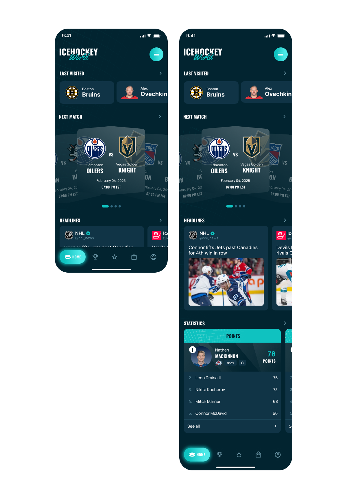
1. Balancing Diverse Content on the “Home” Screen
Integrating “quick navigation to last visited teams/leagues,” “prominently showing news,” and a “social-media style feed” onto a single home screen without making it cluttered or unfocused. The UI designer needs to establish a clear visual hierarchy that allows users to quickly access what they need while also encouraging discovery of new content. The social feed needs to feel distinct yet integrated.
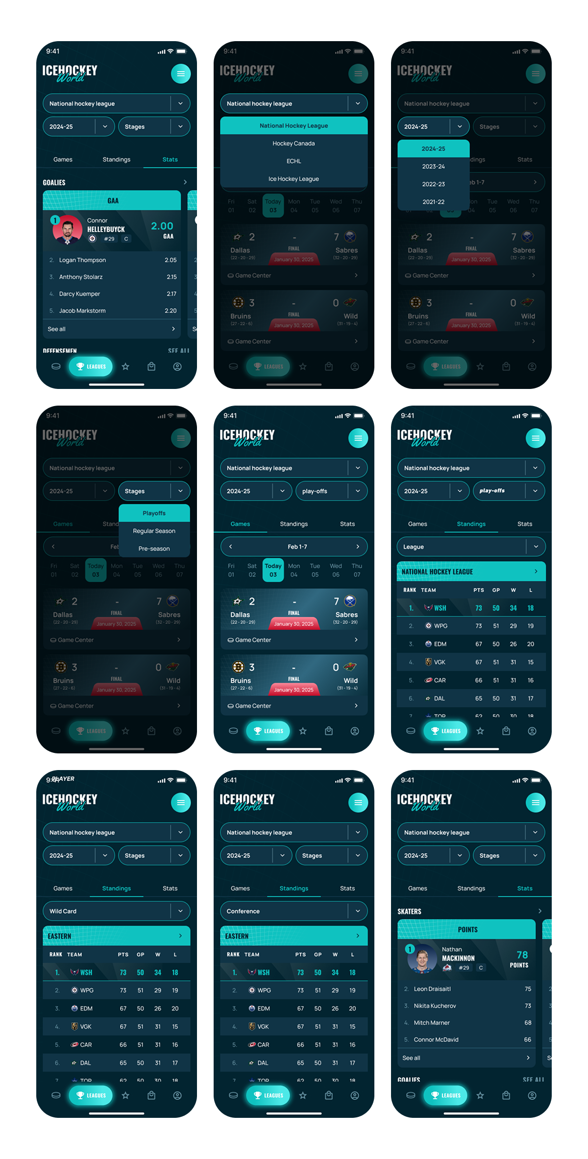
2. Information Architecture and Density on “Leagues” Tab
Designing an intuitive and clear way for users to navigate through multiple layers of selection (league -> season -> league stage) and then access three distinct sub-tabs (games, standings, player statistics) for each selection. This involves managing a potentially large dataset and making it easy for users to find specific information without feeling overwhelmed or getting lost in nested menus. The UI needs to clearly indicate the current context and allow for easy backtracking.
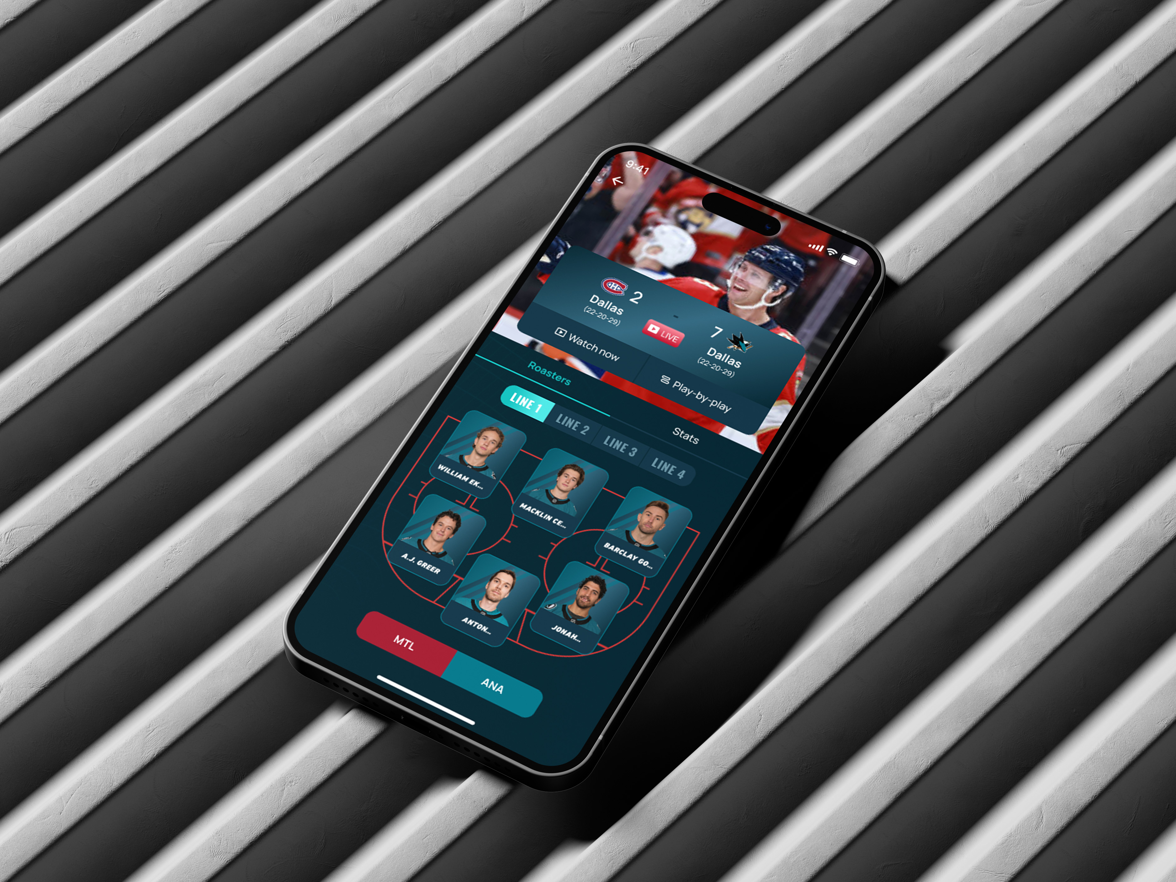
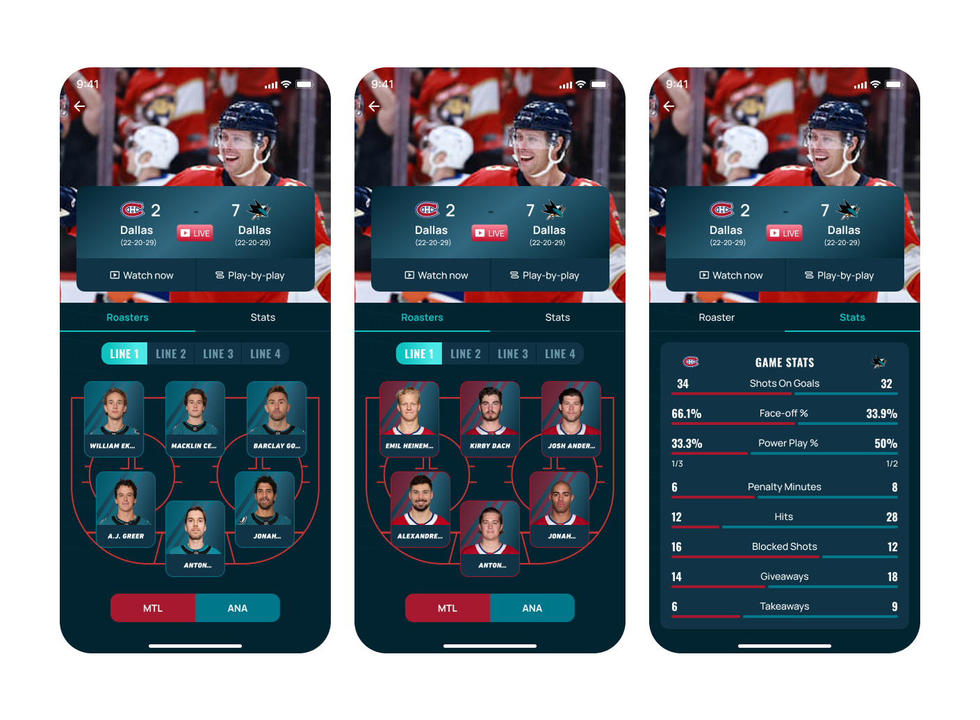
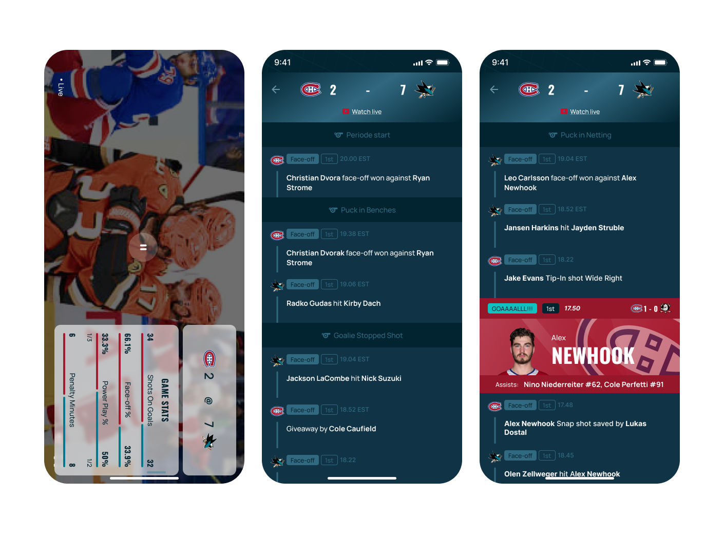
3. Designing an Effective “Specific Game” Screen with Multiple Data Streams
Presenting a live video stream, real-time play-by-play action, team rosters, and detailed stats simultaneously or via easily accessible sub-tabs within a single game view. The UI must allow users to seamlessly switch between these information types, ensuring the live video (if present) is well-integrated and key actions/stats are always accessible or prominent, especially during fast-paced game moments.
4. Cohesive Navigation System with Multiple Entry Points
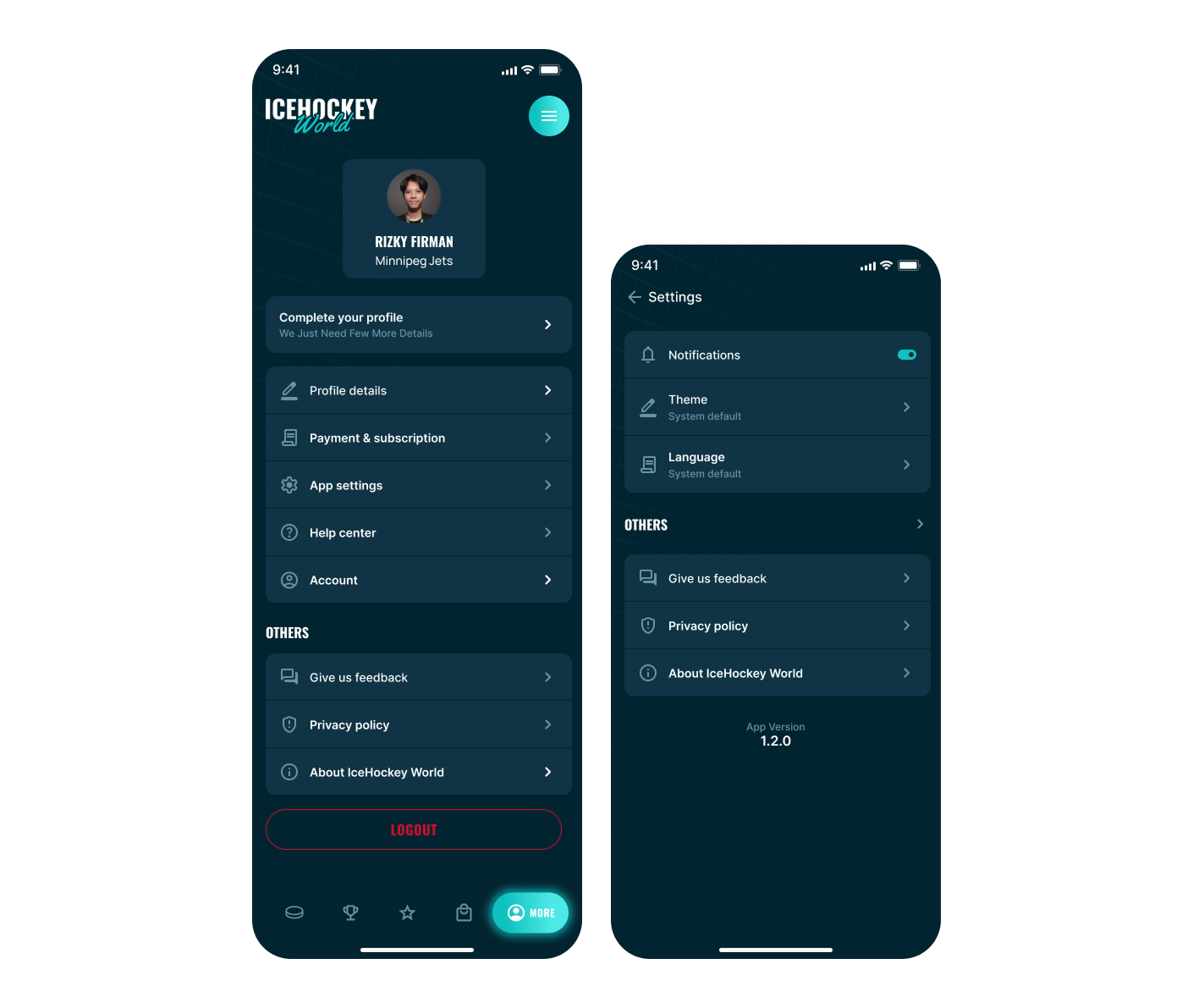
Ensuring the bottom navigation, top-left logo (presumably for home or a brand menu), and top-right hamburger menu work together harmoniously. The hamburger menu’s contents need to be distinct from the bottom navigation and provide clear pathways to less frequently accessed or global sections without causing redundancy or user confusion about where to find specific features. Settings screen are placed in here.
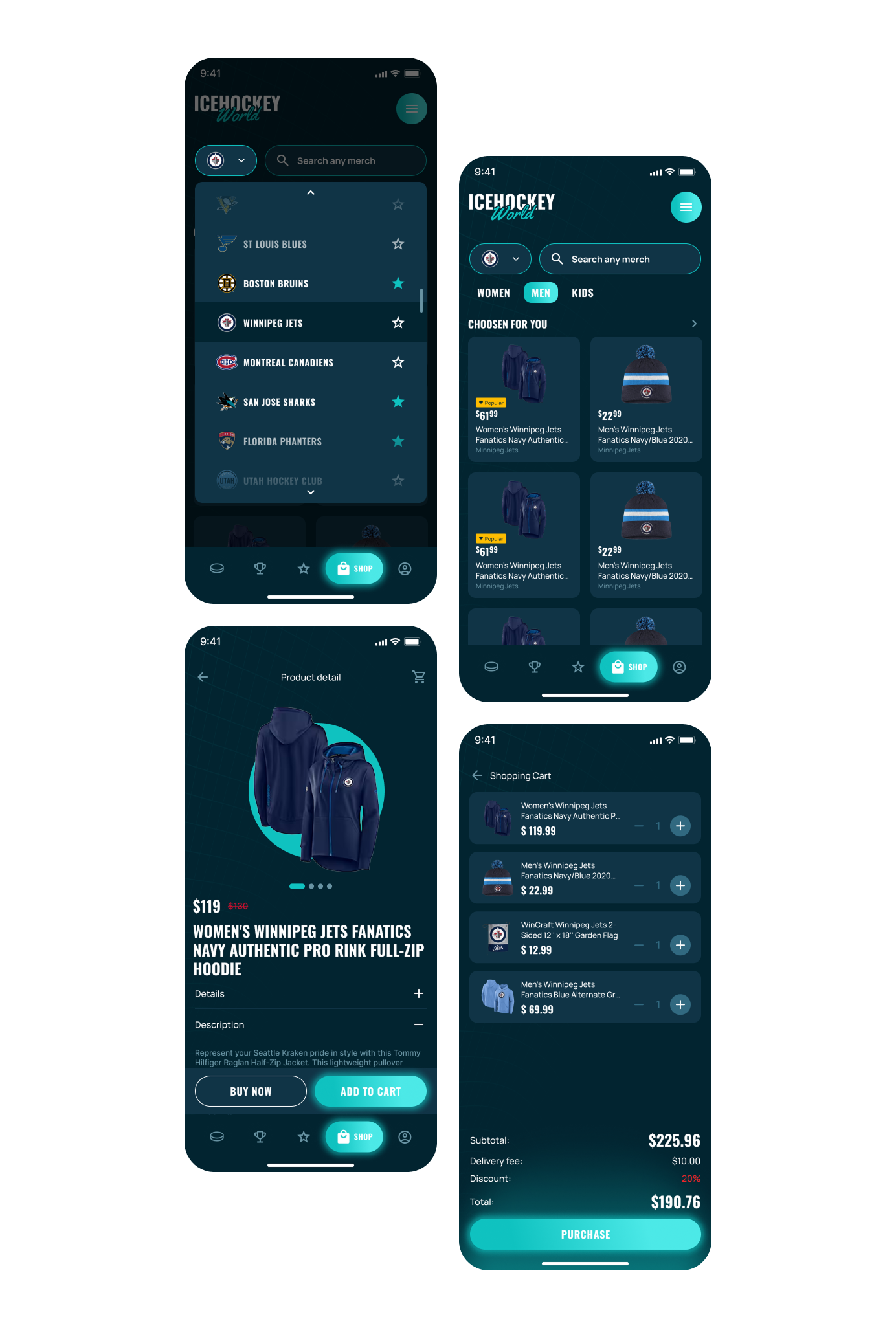
5. Integrating “Shop” Functionality Cohesively
The “Shop” tab introduces e-commerce elements, fans are able to buy their team’s official merchandises. The shopping functionality will be simplified for user to only just select the product and purchase it, not as complex as common e-commerce app.
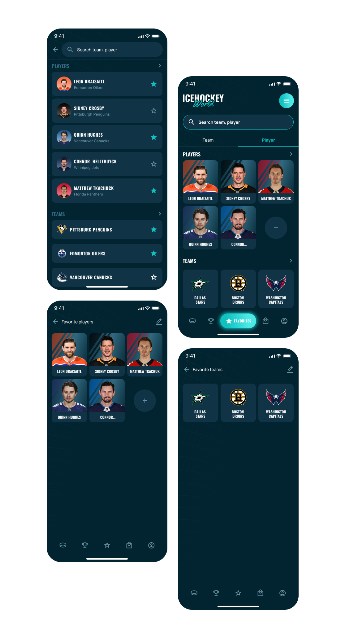
6. Clear Presentation of “Favorites” Management
Creating an intuitive interface for users to search, discover, add, and manage their favorite teams and players. The display of these favorites needs to be clear, providing quick access to relevant information for each followed entity. While the loading screen has specific aesthetic requirements, the primary challenges lie in structuring and presenting the vast amount of interactive content and data across the various core sections of the app in a user-friendly and intuitive manner.
The Solutions
1. Balancing Diverse Content on the “Home” Screen
2. Information Architecture and Density on “Leagues” Tab
3. Designing an Effective “Specific Game” Screen with Multiple Data Streams
4. Cohesive Navigation System with Multiple Entry Points
5. Integrating “Shop” Functionality Cohesively
6. Clear Presentation of “Favorites” Management